Good looks sell, add good functionality to the mix, and you have something that’s irresistible. Apply this context to the UI and UX of your Learning Management System (LMS), and you may have found a solution to the problem of low employee engagement. In fact, we think most L&D often downplay the importance of the UI and UX of an LMS, and that warrants an article talking about why they shouldn’t.
On this Page
Does Your LMS’ UI and UX Matter?
The answer is yes, it does. As we step into a new decade creeping closer towards 2025, more than 75% of the working-force will comprise of people who were born, brought up, dependent, and thrived on computers and social media. For instance, children born in the year 2000 will turn 25 and start filling junior positions at organizations.
Here is a list of few inventions the world saw in 2000:
- Camera Phone
- USB Flash Drives
- Bluetooth
- Blu-Ray Disc
Basically, these children were born in the boom-period of internet-based technology that has shaped the current world. in fact, the internet as we know appeared in 1991, and those born in that time will turn 34 in the year 2025, making them people who are more than half-way up the corporate ladder. Moreover, social media was invented in 2005, and 90’s children were 15 years old and already hooked to it.
Since then, technology has played a major role in the lives of all people born to these generations. These people understand technology, know exactly what is updated and trending, and certainly do not appreciate that what is old.
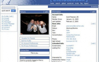
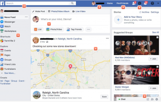
To take an example, let us look at social media. Social media platforms for long have strived to hold their audience’s attention. One of the ways they retain their audience is by adding new features and updates to the system on a regular basis. Of that, updating the UI and UX has been one of their major pursuits.
Here is a timeline of internet’s most popular social media platform from 2008 through 2019 (Left to Right)
As you can see, regular UI and UX updates, no matter how subtle, are a part of the platform’s agenda. And that points towards one thing, the UI and UX of your learning management software is equally important.
What Makes the LMS’ UI and UX important?
In theory, everything about an LMS’ UI and UX is important. Millennials are constantly engaged with software and platforms whose UI and UX upgrades are constant. When most popular software and platforms in use making aesthetic enhancements a regular affair, an LMS that fails to act will most certainly find itself sorely outdated.
The UI and UX are an LMS’ primary bastions against low engagement rates alongside accessibility and features. Modern learners are already weary of the training and development concept. They find it boring, time consuming, and uninspiring to begin with. As a result, when an LMS appears outdated and clunky, it is counteracting a learner’s need to train.
What Type of an LMS UI/UX Do Modern Learners Appreciate?
From our research and discussions with learners and L&D, we identified a set of factors that learners appreciate as a part of a modern LMS. Let us look at them:
Dark and Light Modes
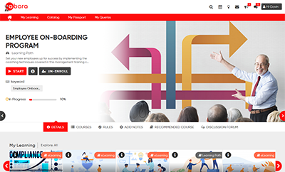
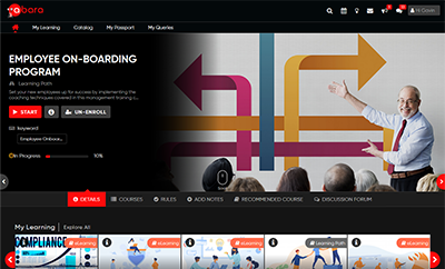
Many people consume training content at night with minimal ambient lighting. This practice can have a negative effect on the eyes and brain. An LMS that operates in a single default mode, i.e.: light mode, is not suited for nighttime training/reading. As a result, learners don’t appreciate an LMS that doesn’t support nighttime reading.
The solution to this is an LMS that supports light mode for daytime reading and dark mode for nighttime reading. Surprisingly, small features like these can have a major influence over how people accept an LMS.
Avoid Jarring Graphics and Design Elements
Along the lines of easing nighttime readability comes another element that soothes the eyes and calms the nerves. As many IDs and courses designers would testify, jarring colors, shapes, text, and images are to be strictly avoided in custom eLearning course design.
The same is with the UI design of learning management systems as well. Light colors, rounded edges, subtle text fonts are a more relaxed approach to designing the UI and UX.
Check your favorite social media platform. Not surprisingly, the buttons and most 4-sided shapes have their edges rounded. The colors used are a shade of white, grey, or silver. Rounded icons and light fonts are soft and easy on the eyes. As a result, the modern UI and UX are soothing rather than attention grabbing.
Clutter-Free Interface and Quick Navigation
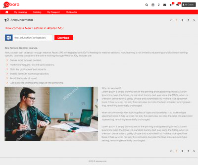
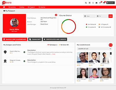
Who likes clutter? Nobody, does. The same applies to the interface of an LMS. A clutter-free interface solves two problems at once. It gives learners a distraction-free environment focused on logging in and heading straight for training. For administrators, it simplifies the administration task by displaying only the most important data and reducing the number of clicks needed to accomplish a task.
Additionally, placing important information in strategic sections ensures that the attention of learners and admins are drawn to where it is needed most.
At Par with Other Software
As learners interact with advanced and sophisticated software, an LMS that doesn’t compare equally, loses its appeal with users. It’s no surprise that as time passes, more LMS vendors will update their UI and UX to look like popular media platforms because an LMS is after all a training and development media storage and consumption software.
Conclusion
The general skeleton of an LMS is expected to change as an LMS’ video and image libraries are updated to look more sophisticated. For too long have people licensed learning management systems that look alike. Learners have grown weary and uninspired, and updating the LMS and subsequently its UI and UX to inspire the latest generation is the way forward!
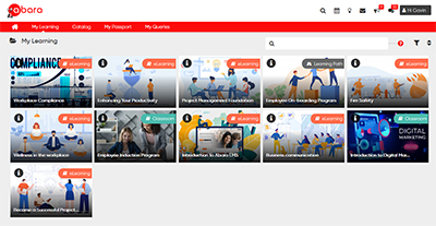
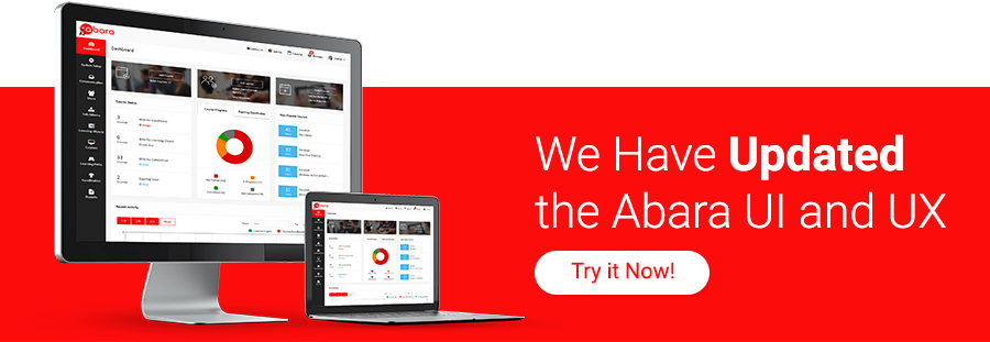
We know the importance of a good looking LMS. Ours was an LMS that followed the same principles that most other LMSs followed. That was till now. The latest Abara LMS sports a new UI and UX. Abara is possibly the only LMS with functional aesthetics that improve learner engagement.
Try the Abara LMS for 30 days at: qhttp://staging.abaralms.com/free-trial/ or reach out to us at contact@abaralms.com to know more about the new UI and UX. You can also fill a callback-form at: ahttp://staging.abaralms.com/contact-us/ and one of our associates will reach you shortly!


